Dodge Challenger Design Evaluation and Challenger SRT10 Concept
 By Cor Steenstra with photography by Chris Jones
We have finally had a chance to drive the Dodge Challenger, in a V6 2009 guise, so we will be reporting to you about this, plus, we will show you dynamic footage of the Challenger SRT10 Concept.
In the 60’s Ford introduced the Mustang as the first of the “pony car” category, and subsequently competitors followed, and of course the pony cars grew in size and power and became the muscle cars at the end of the 60’s. Where the current Ford Mustang harks back to its Pony Car origins, the Dodge Challenger and the soon to come Chevrolet Camaro lean more towards the muscle car era.
The Challenger takes its design clues from it 60’s predecessor and is based on the excellent chassis Chrysler has been using heavily for its 300 and Dodge Charger variations, originating from its Daimler/Mercedes days. It is a good and solid chassis and as such provides solid underpinnings for this. Of course we all know there is the spectacular Hemi powered version, especially the SRT8, but with the fuel prices over the past half year and the economy in the slumb it is, we were kind of interested to see what value the V6 version would bring.
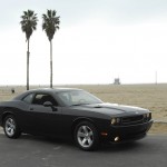
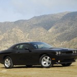
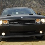
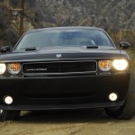
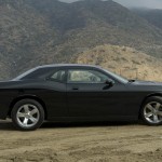
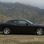
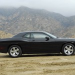
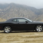
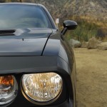
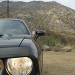
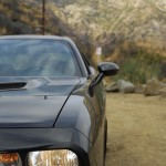
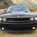
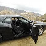
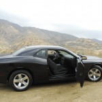
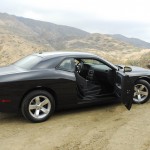
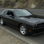
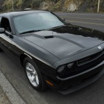
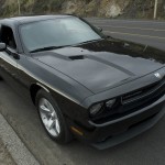
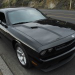
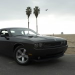
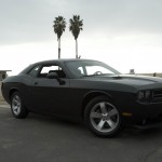
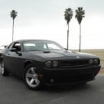
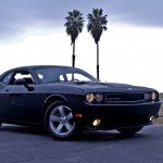
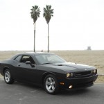
Well, it does. It still has the “WOW” factor heavily baked into it. As an example, my 7 year old daughter, not a car buff by any means, couldn’t hold back her “Wow.., what a cool car dad” exclamation when she first laid her eyes on this black one. It does turn heads, and I must say, it does so more positively then its V8 counterpart in black, which comes with the clightly off-putting red stickers on it.
The fuel consumption is very reasonable in this car. Unlike our experiences with the various Hemi version we have had in the past, here the fuel gauge does not move as drastically, it does not suck fuel like there is no tomorrow. The average consumption at 21 mpg is not low of course, but it beats the 15 mpg we had with the other ones hands down.
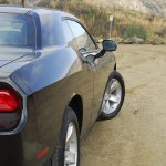
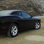
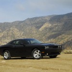
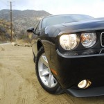
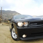
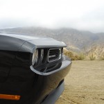
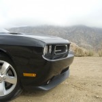
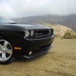
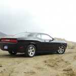
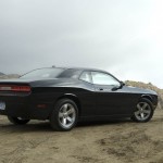
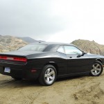
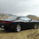
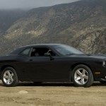
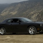
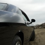
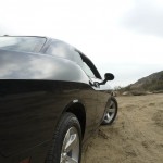
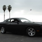
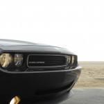
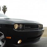
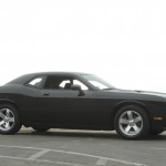
On the exterior design we all felt that something got lost in translations. In the 60’s and 70’s, the designers all used horizontal divisions to optically slim a car down, so that the weight of the side body did not seem overbearing. There were artificial black-out areas, there was tucking in etc. Those are clearly things from years gone by, but then, if you use that same design theme these days, you either have to find a suitable alternative, or you end up with a very heavy impression.
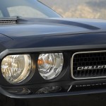
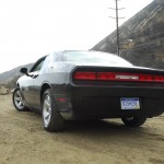
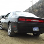
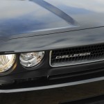
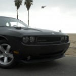
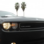
And that is what we have here. If you mask off the lower half of the car, you have a very dynamic retro body style that is very big, very wide, very imposing. If you take the mask away you suddenly realize what massive sides it has, which takes away from the grace and elegance it could have. Added to this is the inevitable problem you get at the front bumper area, where, for tradition, you have to tuck away negatively, but for simple aerodynamics you shoudl not.., and this you get the old fashioned add on spoiler seen on this car, and so very excaguratedly featured on the SRT 10 concept.
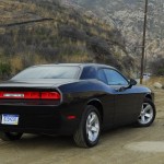
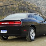
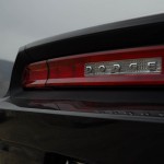
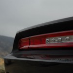
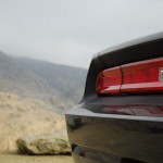
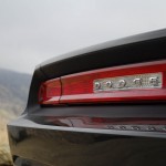
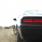
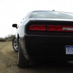
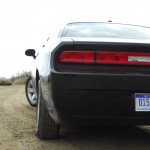
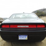
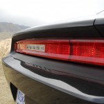
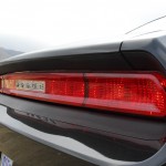
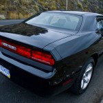
I personally love the rear end though. The way the lights are treated is truly a modern version of the original, and it does not look wrong. It is actually very nice, and it enhances the width of the car. To boot, it is gives way to a huge trunk area as well, so the practicality is not lost.
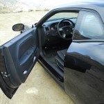
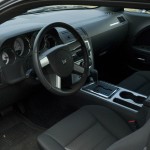
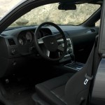
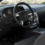
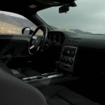
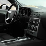
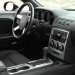
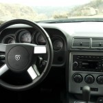
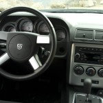
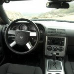
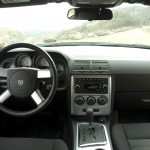
The interior on the one hand does feature some items that reflect the retro character of the exterior, the rest os mainly 200 and dodge parts bin, and in that respect treated with the same disrespect as we have seen in Chrysler cars over the past. It is amazing and sad to see this, especially since Trevor Creed used to be so good at interiors in his Ford days. I just can not fathom how he could have let this farce go on for the past years.
All in all though, we had fun in the car, made some heads turn, got looks, and just felt COOL.. That is not easy to come by these days.

