Peugeot 2008


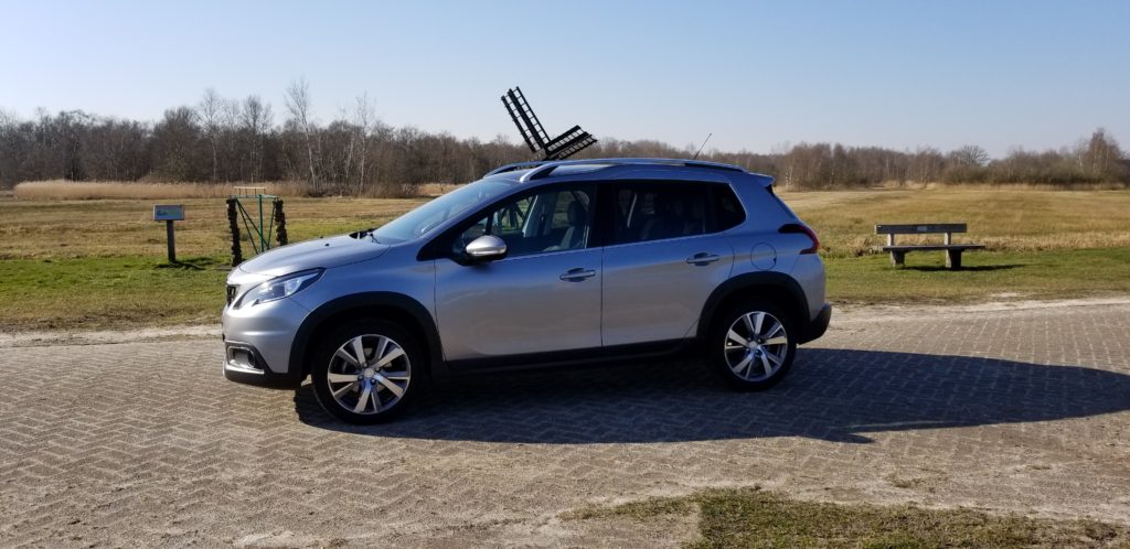
Following my troubling experiences trying to get into the Peugeot 308 I asked Budget Car Rental at Amsterdam Schiphol Airport to get me a taller car. They again only had Peugeot’s available, but guaranteed me that this 2008 was much taller than the 308 Break. It was…..
… but clearly they had moved the H-Point up as well, and moved the whole packaging up so it ended up in a similar position as I had found in the 308. Of course the designers of the 2008 wanted to suggest their baby was a really fast race car as well, so they again angled the front window very sharply, again had the A-Pillar therefore very slanted and again created the same access and egress issue for me. Thank you Peugeot!! That was a horrible, horrible experience, again.
After this I insisted on any other brand of car but a Peugeot. I since rented several Citroen’s, which, since they also come from the PSA group, had me worried about similar problems, since I assumed they shared platforms, but I ended up NEVER having any similar issues with the Citroen’s as I had with Peugeot.
What else can I say about this 2008? Well, it is not a modern design. It seems kind of gimmicky with what they are trying around the headlights, almost Japanese/Chinese like. This sort of styling only treatment does not have any functional advantage, it doesn’t look any better, but it looks different. I guess that is what they were going for here. Oh do I long back to the days when Peugeot had a very clear and unique design language, one you could distinguish from afar. They sacrificed this clearly not for something better, but for something different.
The same can be said for the side graphics and the chrome treatment on the side. Is it functionally better? No! Does it look better? No! So why is it there? Well…, it looks different.. Nobody else has it this way.. And why not? Because it doesn’t look better and it doesn’t function better! That is why!


